Workshop 2 Worksheet
Learning outcomes
By the end of the session, you should be familiar with:
- how to create and interpret cross-tabulations (contingency tables)
- how to create some of the most commonly used plots to visually summarise relationships between two or more variables
- the basic intuition behind “associations” among variables
Intro
We will continue where we left off in the last workshop, completing any exercises that remained unfinished. Then, using some of the same datasets that we downloaded in the last workshop, we tabulate or plot (as appropriate for the given data type) the relationship between the “social trust” variable and some other variables. We will then replicate some of the analyses presented in Wilkinson and Pickett (2009) and Pickett, Gauhar, and Wilkinson (2024), which use data aggregated at national levels to compare the association between social trust and income inequality in a number of economically developed countries.
Exercise 0: Your module data and analysis folder
In Workshop 1 you created a folder for this module on your institutional OneDrive storage drive (e.g. C:\OneDrive - Newcastle University\SOC2069) and within that a sub-folder called “Data”. You used that sub-folder to save the datasets downloaded as part of the exercises in the Workshop 1 Worksheet. If you did not create this folder in Worshop 1, go back to the Workshop 1 Worksheet and follow the guidance there to set up your folder structure for future use.
Exercise 1: Does trust vary by sex?
In Workshop 1 Worksheet - Exercise 1 we explored univariate distributions (i.e. single variables). In that exercise, we used data from the UK sample of the European Social Survey, Round 11 (UK-ESS11). You may have saved your work (and modified dataset) from Workshop 1 as a .jasp file (e.g. “ess11-example.jasp”) as instructed in Workshop 1 Worksheet - Exercise 1.4. If so, you can open that file for this exercise and continue where you left off. Otherwise, follow the instructions in Workshop 1 Worksheet - Exercise 1 to download the dataset (if needed) and load it into JASP.
You can also download the JASP solution file for Workshop 1 Worksheet - Exercise 1 below:
![]() Exercise 1: Descriptive statistics
Exercise 1: Descriptive statistics
In Workshop 1 Worksheet - Exercise 1 we created descriptive statistics summaries, frequency tables and some basic distribution plots for the “social trust”, “sex” and “age” variables in the UK-ESS11. In this exercise, we will check how “social trust” relates to “sex” and “age” by exploring some bivariate descriptive statistics.
As we know from the lecture, just as with univariate descriptions, the choice of tabulation and visualisation options depends on the types of variables we are exploring. We begin by describing the relationship between two categorical variables using contingency tables (also known as cross-tabulations). We call them “contingency tables” because they show us the values of one variable contingent on the values of the other, or “cross-tabulations” because we present the frequency distribution of one variable as distributed across the levels of another categorical variable.
1.1. Contingency tables
- Open the
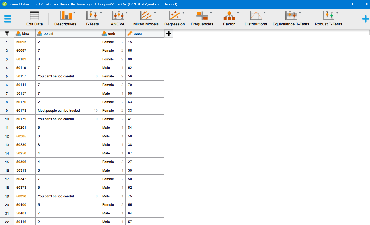
gb-ess11-trust.savdataset in JASP. You should now see something like this:
- Identify the following two variables in the dataset: “social trust” and “sex”. We are interested in finding out the distribution of “social trust” among men and women. For this, we will create a contingency table. Use the Frequencies > [Classical] Contingency Tables menu option. Move the “social trust” variable to the Rows field and the “sex” variable to the Columns field. You should be seeing something like this:
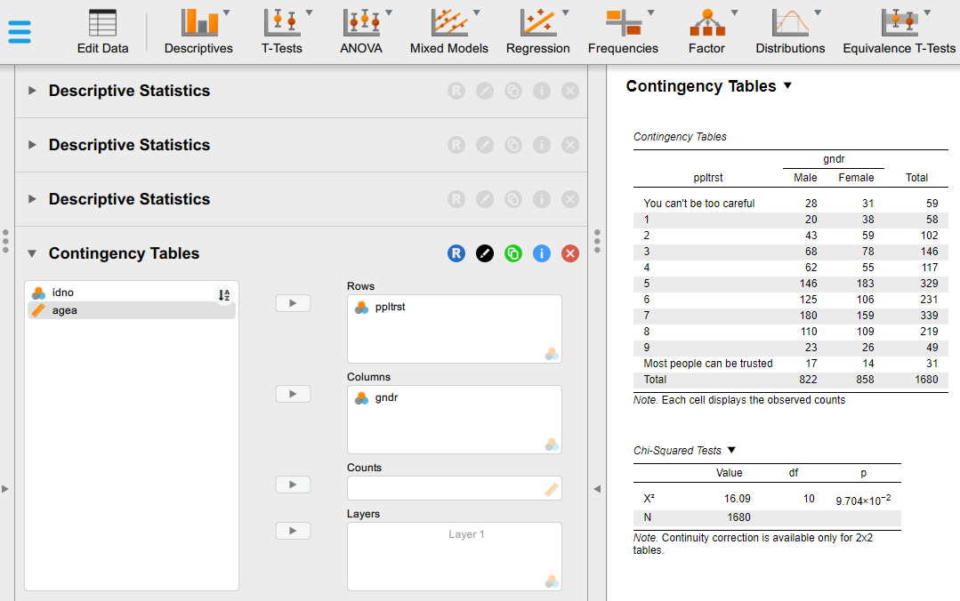
- By default we can see the observed counts in each cell of the table. This tells us the exact number of respondents of different sexes in each of their chosen category of the social trust scale. This may be able to tell us something useful in very small tables, but in this case, it is hard to decipher the message. To improve the interpretability of the table, we can change it so that it displays percentages instead of raw counts. To do that, expand the Cells sub-menu and experiment with the options. The best solution in this particular case - to avoid having a too overloaded and complex table - is to untick the “Observed” counts box and instead select only “Column” Percentages; that will tell us the percentage distribution of responses on the “social trust” scale within each sex group. You should be seeing something like this:
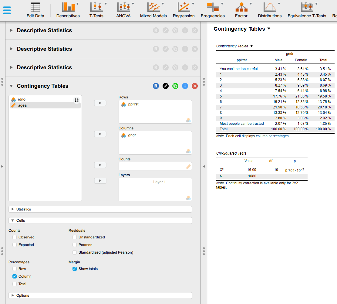
- If we change to - or add Row Percentages - , that will tell us the percentage of men and women within each category of the social trust scale. Try that too and think about the difference compared to the previous option.
- Interpret the Contingency Tables part of the output (you can hide the Chi-Squared Tests table from the output by un-ticking the \(\chi^2\) option under the Statistics sub-menu).
Questions
- How many women in your dataset answered “You can’t be too careful”?
- What percentage of the men in your dataset answered that “Most people can be trusted”?
- What percentage of those who answered “Most people can be trusted” are men, and what percentage are women?
- Based on your cross-tabulation, do women or men in your dataset have a higher level of “social trust”
1.2. Box plots
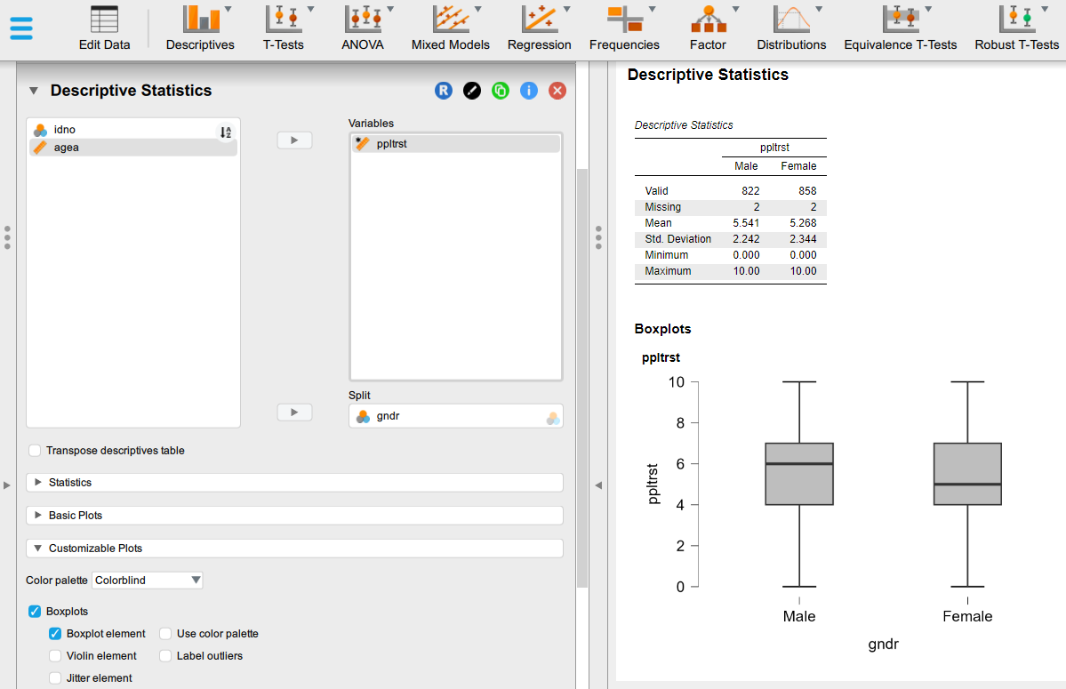
We have seen last week that the “social trust” variable measured on a 0-10 eleven-point scale is best treated as a “Scale” (i.e. numeric) variable instead of treating it as a “Nominal”/“Ordinal” categorical variable as we have done above; and we know from the lecture that if we want to visualise the relationship between a categorical Nominal variable (like “sex”) and a numeric Scale variable (as the eleven-point social trust measure), the best approach is through a box plot, which would tel us the average measured level of trust across the different categories of the categorical variable (i.e. for “men” and “women” in this case).
To generate a box plot, we return to the descriptive analysis tabs that we are already familiar with:
Create another new descriptive analysis in your JASP session (Descriptives > Descriptive Statistics menu option), to keep your previous analysis above intact on the output page;
We will now check the distribution of “social trust” across the two sexes measured in our data. Move the “social trust” variable to the Variables box and the “sex” variable to the Split field.
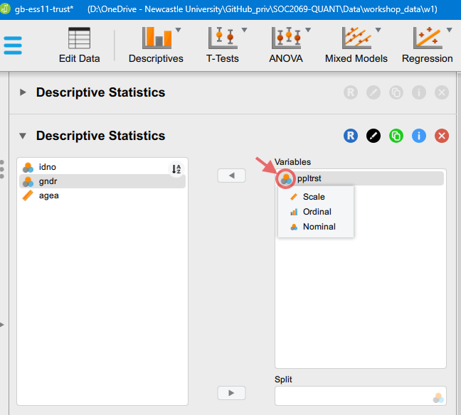
You may remember from Workshop 1 Worksheet - Exercise 1 that we can manually change the measurement type of our variables for a specific analysis without altering the underlying data more permanently. In this case, we will need to change the type of the “social trust” variable to “Scale”. Click on the measurement type icon (not the text bale, but the icon), which will bring up the options we see in the image below:
Then, we can change the type.
- After we make the change to the variable type, we can click on the “Customizable Plots” option set in the left panel and tick the “Boxplots” option. You should bee seeing something like this:
- If weeded, we can resize the output graph by hovering over the plot and dragging out the bottom-right corner.
Questions
- What is the box plot telling us? Note down everything that comes to your mind. How does the boxplot visualise the information displayed in the “Descriptive statistics” table above? You can use the lecture slides to remind yourself of the information contained in box plots.
Exercise 2: Is age associated with social trust?
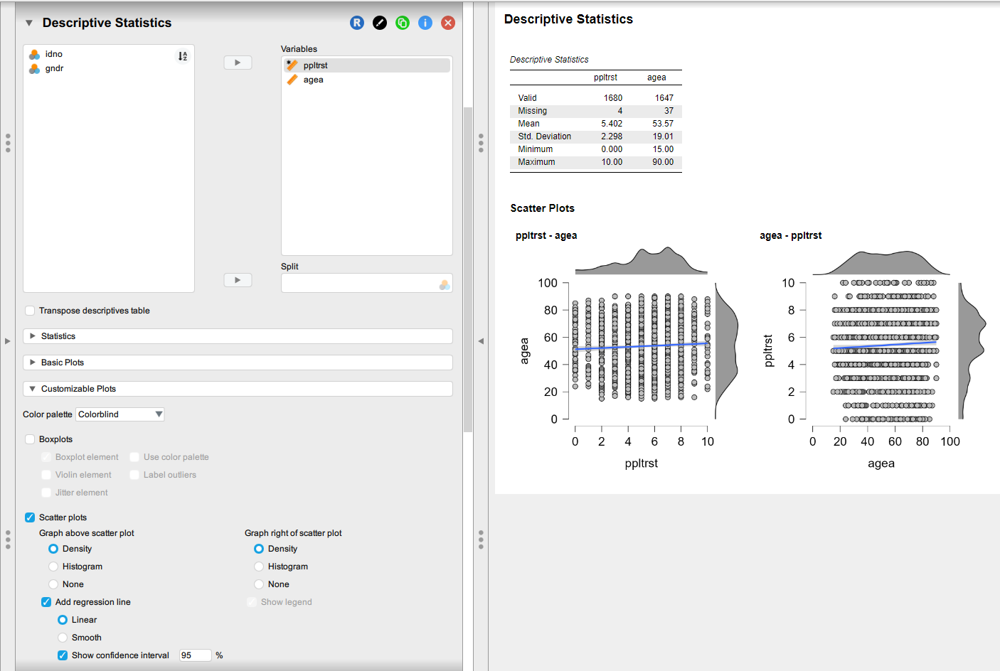
In this exercise we will be using the same dataset as in the previous exercise, but we will explore the association between “age” and “social trust”. If we treat out measurement of “social trust” as a Scale measurement, then this means that we are exploring the relationship between two Scale-type variables; you may remember from the lecture slides that the appropriate visual analysis tool in this case is a scatterplot.
2.1. Scatterplots
In JASP, we can generate basic scatterplots using the already familiar descriptive analysis menu options:
- Create a new descriptive analysis in your JASP session (Descriptives > Descriptive Statistics menu option). This will keep the outputs you created earlier in your JASP analysis workbook and append the new analysis underneath.
- Move the two variables of interest over to the Variables box (both of them in the same box);
- Change the type of the “social trust” variable to Scale, as you have done in the previous analysis;
- Expand the Customizable plots option and tick Scatter plots;
- You can play around with the options under Scatter plots to simplify the plot (e.g. remove the univariate distributions of the variables displayed on the margins/changed them to histograms, remove the regression line, etc.). You can also manually increase the size of the plot by dragging the bottom-right corner.
The order in which you list the variables in the “Variables” field matters: the variable listed fist will appear on the X axis, and the variable listed second will appear on the Y axis. You can manually reorder the variables in the list by dragging them. Try changing the order of the two variables.
You should be seeing something like this:
Questions
- What is the scatter plot telling us? Note down everything that comes to your mind.
- What happens if you add the
gndrvariable to the Split box?- Try to interpret what this tri-variate relationship is telling us (the Descriptive Statistics table is probably more useful here)
Exercise 3: Is income inequality associated with social trust?
For this exercise, go to the Data site and roll down the section on Trust & Inequality.
The lecture has already introduced the 2009 book The Spirit Level by Wilkinson and Pickett (2009). There, they argued that the level of income inequality in the most economically developed countries is correlated with a number of social problems, reduced levels of social trust among them. They updated their analysis fifteen years later (Pickett et al. 2024). Datasets related to their analyses can be downloaded from the Data site. The two datasets available there allow us to replicate the analysis of the relationship between income inequality and social trust summarised in Figure 4.1 (Chapter 4: “Community life and social relations”, pp. 49-62) of Wilkinson and Pickett (2009) and Figure 7 (page 16) in Pickett et al. (2024) (see also Pickett (2024)). You can read more about the measurement of income inequality here.
Download the datasets to your Data (sub)folder and open them in JASP;
Create summary descriptive statistics for all the variables in the dataset (Descriptives > Descriptive Statistics menu option).
Because there are only a few variables in the dataset, you can select them all by clicking one of them, then Ctrl + A, and moving them all over to the Variables box
Visualise the relationship between “income inequality” and “social trust” using the steps practiced in the previous exercise.
We can use these datasets to play around with some more advanced visualisation options to reproduce the published figures. It would require too much detail to give step-by-step instructions on how to do this, but you can download two worked-out JASP worksheets and check through all the options:
![]() Exercise 3a: Reproducing Figure 4.1 in Wilkinson & Pickett (2009)
Exercise 3a: Reproducing Figure 4.1 in Wilkinson & Pickett (2009)
Exercise 4: Continue your analysis for Assignment 1
Building on the work you have done in Workshop 1 Worksheet - Exercise 3, open the dataset you have used to address one of the questions below.
Identify (the) two main variables relevant to the question, perform univariate descriptive statistics, and check their relationship using one of the plots/tabulations practised in the previous exercises above.
Select some other variables of different types and check their association with your main dependent variable using the plots/tabulations practised in the previous exercises above.
Reminder of the research questions to choose from to address in Assignment 1:
- Are religious people more satisfied with life?
- Are older people more likely to see the death penalty as justifiable?
- What factors are associated with opinions about future European Union enlargement among Europeans?
- Is higher internet use associated with stronger anti-immigrant sentiments?
- How does victimisation relate to trust in the police?
- What factors are associated with belief in life after death?
- Are government/public sector employees more inclined to perceive higher levels of corruption than those working in the private sector?
For now, choose one question that you find most sympathetic (you don’t need to stick with it for the assignment, but you could if you wanted to!). All of the questions can be answered with at least one of the survey datasets that you downloaded (the “WVS7” or “ESS10”) and often they both contain relevant variables.
JASP solutions
Below you can download JASP files with solutions to some of the exercises in this worksheet: